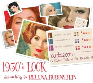
An insight into the science of beauty from the 1950’s from Helena Rubinstein –
Check out House of Fraser’s big 1950s makeup post after you’ve read this. Glamourdaze are one of the contributors !
The 1950’s Color Palette.
In that glamorous era of the 1950s the idea behind choosing your ‘color type’ was to specifically match your natural hair and complexion colors with your clothes and makeup.It was all very scientific. Helena Rubinstein frequently waxed lyrical about what she called “Self Harmony!”
The Art of Beauty in the 1950s was a science, and many heavy-weight tomes were devoted to the subject, but to make life simple for the modern girl – here is the basic lowdown – according to Ms Rubinstein on achieving the correct 1950s style. If you follow this, you wont just look like a 1950s stereotype, but will emulate the exact beauty technique that women back then followed.
You broke your personal color chart into 3 palettes.
1.The Principle Color palette.
2.The Complimentary palette.
3.The Dramatic contrast palette.
Once you chose your wardrobe – for day wear, evening wear or special occasions- you then created your 1950’s makeup colors to match one of these 3 color charts.
Here are the basic 1950s color charts for your type:
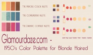
Blonde Haired –
1.The Principle Color palette – Gold,muted or grayed yellows
2.The Complimentary palette – Sky Blues down to marine greens
3.The Dramatic contrast palette – Vivid Magenta’s
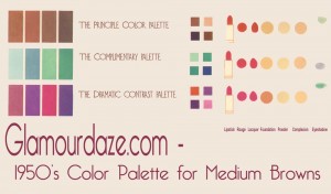
Medium Brown Haired –
1.The principle Color palette – choose all the shades of brown you see in your hair
2.The Complimentary palette – spectrum of blues
3.The Dramatic contrast palette – pinks,magenta, fuchsia, red orchid
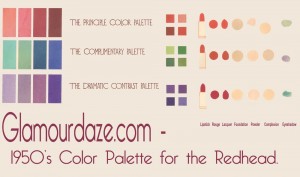
Red-Heads-
1.The Principle Color palette – soft pinks, muted rose, warm red and brick reds
2.The Complimentary palette – blues to greens.
3.The Dramatic contrast palette – deepest purple
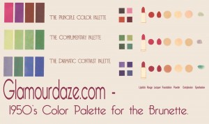
Brunette-
1.The Principle Color palette – burgundy wine reds,purplish reds
2.The Complimentary palette – tropical greens
3.The Dramatic contrast palette – all one color:black,white,blue etc.
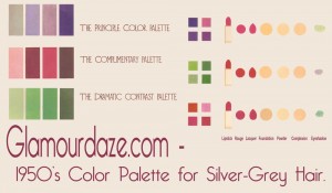
Silver Gray Hair-
1.The Principle Color palette – Muted blues, lilacs, soft purples, mauves
2.The Complimentary palette – soft yellow greens
3.The Dramatic contrast palette – Cardinal Red.
House of Fraser have cited this post for their blog 1950s Makeup Trends by House of Fraser.


